


Focus group participants expressed a variety of views in relation to their agency’s openness in using generative AI in their work. Three focus group participants voiced concerns about a perceived stigma or negative reaction if they openly acknowledged their Copilot use. The stigma originated from a belief that Copilot negated the need for staff to use their own critical thinking skills – thereby suggesting that Copilot encouraged laziness.
In comparison, in agencies where leaders actively encouraged and expected Copilot use, focus group participants reported positive reactions towards Copilot and uptake. Two focus group participants from different agencies reflected that publicly communicating ways that senior leaders effectively used Copilot drove positive sentiment. For example, one focus group participant from the DTA mentioned that their chief executive officer (CEO) showcased how he had been using generative AI, which led to a perceived uptick in usage within the agency.
Trial participants working in policy roles voiced concerns regarding the use of Copilot in producing policy advice, believing that this function should be solely human-led. These trial participants viewed the use of AI to support the development of policy could lead to a deterioration of the trust and confidence of the public and create broader ethical issues.
Related were the fears of inputting information into Copilot that were sensitive in nature. In focus groups, participants from policy job families vocalised a well-founded hesitation to use Copilot on any remotely sensitive agency information which was regularly reinforced by their agencies.
Varying levels of stigma around AI use suggests that leaders will be critical in both championing its use but also reducing any negative associations within agencies in the use of generative AI.
Some participants feel uncomfortable about being transcribed and recorded and perceive that they are being pressured to consent.
While the transcription functionality provides benefits in producing meeting summaries, focus group participants have expressed discomfort with being recorded and transcribed. Three focus group participants voiced concerns about the broader implications of real or perceived staff coercion to accept transcription if it becomes a norm.
An additional 2 focus group participants raised concerns around whether there would be an expectation that all meetings – even informal ones, will be transcribed. In response to these concerns, some agencies have chosen not to permit transcriptions.
As use of generative AI tools increase across the APS, considerations around etiquette and what constitutes normal or acceptable use will need to be worked through. Concerns around transcription highlight the need for clear guidance, processes and expectations from agencies. This should include the possible ramifications of transcription, ranging from legal requirements through to job expectations. In developing this guidance, agencies need to listen to, consider and respond to staff concerns.
Certainty of legal and regulatory requirements is needed to ensure responsible use of generative AI
There is a need for clearer guidance on the accountability for Copilot outputs.
As generative AI becomes more advanced, questions arise around the extent to which a human is accountable for the output and whether they can attribute responsibility to generative AI. One of Australia’s 8 AI Ethics Principles highlights, ‘people responsible for the different phases of the AI system lifecycle should be identifiable and accountable for the outcomes of the AI systems, and human oversight of AI systems should be enabled’.
While focus group participants unanimously agreed that users of generative AI are ultimately accountable for the output, they noted accountabilities were not always clear particularly when users were unable to verify the suitability of the inputs used. For example, in the instance whereby a staff member unknowingly uses sensitive data to produce a public-facing document, it is unclear if the accountability lies with the person who stored the data, the person who created the document, the person who reviewed and approved the document or if all these parties should be held accountable.
There are likely many more instances whereby the remit of persons accountable where generative AI has been used is unclear and will require multiple agencies to work together to provide cohesive and aligned advice on accountabilities and expectations regarding the use of Copilot and generative AI more broadly.
There is uncertainty around communicating Copilot’s use with the public.
The APS is required to safely manage personal, sensitive and restricted data. Additionally, the public expect their data to be appropriately managed and used. In the wake of the Royal Commission into the Robodebt Scheme, public scrutiny around the APS’ use of technology and automation to support decision-making is particularly high.
Focus group participants expressed uncertainty regarding whether informed consent from customers is required before their data and information could be used in Copilot. For example, focus group participants were unclear whether consent was required from customers to use customer information to draft a letter responding to a customer query.
One focus group participant noted that customers may worry about Copilot use given wider societal concerns around AI security and output quality. They remarked that despite certainties around information security, members of the public will likely hold a range of preferences, including a preference that generative AI does not access their personal data and information.
Similarly, there is also a lack of consensus as to whether Copilot users should provide a disclaimer to the public on Copilot use. Five focus group participants believe that the public should be able to know if content is AI generated to increase transparency. However other focus group participants were concerned that disclaimers could contribute to a decline in quality as users would reduce their diligence in checking outputs as they could attribute errors to generative AI use outlined in the disclaimer.
Public concern about security and protection of personal, sensitive and restricted data is a key consideration as the APS moves forward with generative AI tools. It is likely that guidance will become more available as regulatory frameworks are implemented by relevant bodies. Agencies should consider privacy laws and potential customer implications if generative AI is exposed to this data to determine a responsible approach to this challenge.
It is unclear whether transcriptions are subject to Freedom of Information laws.
Government agencies are subject to Freedom of Information (FOI) requests which give people the right to request access to government-held information.
Whether meeting transcription outputs and other outputs produced by generative AI were subject to FOI requests, was a question raised by focus group participants. Two focus group participants expressed concerns that if meeting transcriptions are subject to FOI requests, it could hinder open expression and communication during meetings, thereby decreasing human connection and collaboration. Other jurisdictions, such as the Victorian Government have been explicit that, ‘records created by or through the use of AI technologies are public records and must be managed in accordance'.
Additionally, 2 focus group participants raised concerns that the transcription may erroneously attribute statements or misrepresent the conversation.
The questions and concerns raised by participants during focus group discussions indicate that APS staff would benefit from clear communication on FOI requests in relation to generative AI produced outputs including any safeguards needed to ensure accuracy in its transcription.
Adaptable planning and clear roles and responsibilities is needed
There is a need to ensure the most appropriate level of governance is in place that is aligned to the risk appetites of agencies.
The adoption of generative AI poses significant governance challenges as several agencies hold notional responsibilities for different aspects related to generative AI. For instance, the responsibility for information management and privacy lies with the Office of Australian Information Commissioner (OAIC) while DTA was responsible for the implementation of the trial, supported by the AI in Government Taskforce.
The complexity of the issues related to generative AI led to confusion amongst trial participants in seeking the responsible agency to provide relevant advice. Three focus group participants responsible for their organisation’s implementation of Copilot highlighted a lack of whole of government advice on areas such as privacy, records management, and intellectual property. These focus group participants had hoped that the National Archives of Australia, Intellectual Property Australia or the DTA would have provided more information.
While there was confusion regarding advice on key issues related to Copilot, there was considerable contestability regarding the overall trial’s approach to risk management. Some focus group participants thought that individual agencies should be responsible for their governance and risk management processes and did not see the additional value of having more governance bodies for the trial.
Two focus group participants responsible for their organisation’s rollout believed it was beneficial to create their own risk register and privacy impact assessments (PIAs) rather than relying on the existing risk management processes in the trial.
The experience of the trial brings to light the differing risk appetites of agencies across the APS and that while centralised advice may be useful, and indeed in demand, centralised approaches to risk and governance may not be aligned to agency’s needs.
There is a need for detailed but adaptive implementation planning.
The DTA led the rollout for the Australian Government trial of Copilot, supported by the AI in Government Taskforce, which included representatives from other agencies such as Services Australia and DISR.
The DTA demonstrated agility and pace in the way they led the trial, effectively responding to the rapid implementation approach required. Discussions with focus group participants highlighted the challenges of rapid implementation with new technologies, noting that the recency and evergreen nature of the technology, inherently led to a continual need to review and develop governance and risk management approaches.
Experiences from the trial highlighted the importance of time spent planning for the rollout of complex technologies such as generative AI. However, the nature of generative AI also requires an adaptable and continually updated approach to adoption that considers the evergreen nature and changing risk profiles of generative AI.
Reference
- Commonwealth Scientific and Industrial Research Organisation (2024) ‘Copilot for Microsoft 365; Data and Insights’, Commonwealth Scientific and Industrial Research Organisation, Canberra, ACT, 12.
- Microsoft, (2024) Internal communication between the Digital Transformation Agency and Microsoft’.
Key insights
Generative AI tools could improve staff inclusivity and strengthen employee-value propositions which could positively impact ways of working and staff satisfaction across the APS.
Risks such as potential job loss, perpetuation of subconscious bias and western norms as well as changes to workers’ skill composition must be effectively managed and monitored to ensure the effective and responsible use of generative AI.
The intended outcomes of the trial aimed to increase users’ confidence in the use of Copilot, improve productivity from regular access and use, improve sentiment reported from regular access and have unintended outcomes identified and catalogued.
Trial participants identified a range of unintended benefits and risks which are detailed below.
Generative AI could improve inclusivity and the attractiveness of the APS as a workplace
Generative AI could improve inclusivity and accessibility.
A user can alter the style and language of texts in Copilot to their preferred format. For example, focus group participants often raised the benefits of Copilot being able to convert technical concepts and subject matters into simple terms as well as translate documents into an employee’s preferred language.
Several trial participants highlighted the benefits of Copilot in ensuring the appropriate tone was used in their content, testing their thinking and refine their outputs with Copilot, checking their grammar and structure of their content, and explaining concepts in a way they found individually helpful and enabled them to more effectively deliver outputs.
The potential of Copilot in improving accessibility was also noted. One trial participant in the post-use survey highlighted that they can more easily rewrite their word documents using accessible language, such as plain English which could enhance government’s communication with the public.
The adoption of Copilot and generative AI more broadly in the APS could help the APS attract and retain employees.
The APS must actively compete in the labour market to attract and retain top talent, especially in high-demand fields such as technology and data analytics. The APS Employee Value Proposition aims to address attraction and retention issues at the enterprise level by raising awareness of the APS as an employer and sending a positive message about working for the APS.
Two focus group participants believed that the APS’s adoption of Copilot was important in attracting employees. They viewed that the APS could be seen as a leader in generative AI and could attract younger generations to choose the APS as a place where they could learn skills in generative AI.
The potential importance of the APS adopting generative AI to prospective employees suggest that the APS should look to further consider the role of generative AI in its Employee Value Proposition.
There are broader concerns regarding generative AI’s impact on jobs, industry and the environment
There are concerns regarding the impact of generative AI on jobs.
Concerns about job loss are common in discussions of AI. These fears stem from the idea that AI will become a more cost-effective, efficient and more effective operative than humans. The World Economic Forum’s Future of Jobs Report (2023) argues that the number of clerical or secretarial roles is likely to decline, while roles for AI and machine learning, data analysis and digital transformation specialists are expected to grow. In Australia, 75% of administrative and clerical staff are women.
Focus group participants articulated a concern that Copilot would lead to efficiencies that would reduce the number of employees needed to complete the same amount of work across the APS. Two focus group participants expressed concerns that job losses would be concentrated in certain job types and demographics. It was feared that time savings from administrative tasks, such as note-taking and producing minutes, could lead to job loss among administration staff.
Interviews with Australian Government agencies highlighted that women could be disproportionately impacted as they currently comprise most APS administration staff. Interviewees remarked that entry-level administration jobs are important pathways for women and other marginalised groups to enter the APS and as a result were concerned that generative AI may further create barriers for disadvantaged cohorts to enter the APS.
The potential for generative AI to reduce employment opportunities or significantly alter job roles elicited strong responses. Agencies should engage with staff to manage reactions and provide assurances about generative AI's impact. Additionally, generative AI's impact on employment opportunities across different demographics should be regularly monitored to ensure that specific groups do not experience unfair rates of job disruption or displacement.
Copilot outputs may be biased towards western norms and may not appropriately use cultural data and information.
Generative AI models can inadvertently amplify societal biases present in their training data. This could lead to outputs that reflect historical inequalities and stereotypes.
Trial participants were cognisant of the risks associated with the misappropriation of cultural data and the lack of non-western norms in outputs. For example, one trial participant perceived that Copilot was prioritising western thinking and did not acknowledge the existence of non-western ideas or frameworks. Other trial participants highlighted the challenges Copilot had with using First Nations words often leading to misspelt places or names.
Informal observations made by Home Affairs staff participating in a Hackathon indicated that a weakness of Copilot was the introduction of invisible bias (Department of Home Affairs 2024:10). Further, a pre-trial survey conducted by CSIRO found that some CSIRO trial participants had ethical concerns about potential biases in the LLM model (CSIRO 2024:8).
Generative AI may change the skills composition of workers.
As users turn to generative AI to complete more of their work – in particularly summarisation and re-writing content, there are concerns that staff may ‘forget’ how to performs these tasks without Copilot.
Across focus group participants, there are mixed views regarding the effect of Copilot on skills development. Two focus group participants noted that they were concerned that Copilot may result in APS staff not needing to develop and maintain their subject matter expertise as they can instead rely on Copilot. They also commented that a reliance on Copilot for writing could decrease participants’ writing skills and ability to construct logical arguments.
However, 2 focus group participants remarked that reductions in competencies in some areas is acceptable as generative AI will fundamentally change the skills that are needed in the APS. For example, one focus group participant commented that taking notes will become less important whereas critically assessing output will become more relevant.
The concerns around potential skill decay suggest that there should be ongoing analysis into key workplace competencies as generative AI becomes increasingly incorporated in the APS. This analysis could also identify how to best support skill development in these competencies.
There are concerns related to vendor lock-in.
Vendor lock-in refers to a situation where a customer becomes overly dependent on a particular vendor's products or services, making it difficult, costly or impractical to switch to another vendor or solution. Vendor lock-in can happen through proprietary technologies, incompatible data formats, restrictive contracts, high switching costs, complex integrations and specialised knowledge requirements.
To use Copilot, an organisation must have a Microsoft365 licence that allows them to use a range of Microsoft products. Two focus group participants noted that Copilot’s easy integration with existing Microsoft licences could mean they are likely to remain with Copilot even if better products become available and that this could reduce competition.
The potential for Copilot to result in vendor lock-in suggests that agencies should look to monitor alternative generative AI options that may better suit their needs. This is particularly pertinent for products that may be more effective but also more difficult to implement.
Generative AI use could increase the APS’s environmental footprint.
Most generative AI products have a high carbon footprint. This occurs as AI models require vast amounts of energy to power their data centres that train generative AI models and to power each individual request. Some photo-generation generative AI tools use as much energy to produce an image as it takes to fully charge a smartphone (Luccioni et al. 2024).
The APS Net Zero Emissions by 2030 outlines the APS’s commitment to achieve net zero in government operations by 2030. One focus group participant was concerned that Copilot will lead to an increase in the APS’s carbon footprint as more licences are distributed and adoption continues.
This suggests that future uptake should also consider the carbon footprint of potential models, in line with agencies’ own targets around reducing their footprint.
Reference
- Commonwealth Scientific and Industrial Research Organisation (2024) ‘Copilot for Microsoft 365; Data and Insights’, Commonwealth Scientific and Industrial Research Organisation, Canberra, ACT, 8
- Department of Home Affairs, ‘Copilot Hackathon’, Department of Home Affairs, Canberra, ACT, 2024, 10
- Luccioni S, Jernite Y and Strubell E (2024) ‘Power Hungry Processing: Watts Driving the Cost of AI Deployment?’, FAccT ’24: Proceedings of the 2024 ACM Conference on Fairness, Accountability and Transparency, https://arxiv.org/pdf/2311.16863, (accessed 3 September 2024).
A.1 Overview of the Microsoft 365 Copilot trial
The whole-of-government trial of Copilot was conducted to examine the safe and responsible use of AI in the Australian Public Service (APS).
On 16 November 2023, the Australian Government announced a 6-month whole-of-government trial of Microsoft 365 Copilot.
The purpose of the trial was to explore the safe, responsible, and innovative use of generative AI by the APS. The trial aimed to uplift capability across the APS and determine whether Copilot, as an example of generative AI:
- could be implemented in a safe and responsible way across the government
- posed benefits and challenges/consequences in the short and longer term
- faced barriers to broader adoption that may require changes to how the APS delivers on its work.
The trial provided a controlled setting for APS staff to explore new ways to innovate with generative AI. It also served as a useful case study that will inform the government’s understanding of the potential benefits and challenges associated with the implementation of generative AI.
The trial was co-ordinated by the DTA, with support from the AI in Government Taskforce, and ran from January to June 2024. The DTA distributed over 7,769 Copilot licenses across almost 60 participating agencies. The trial was non-randomised – agencies and individuals volunteered to participate. A full list of agencies that participated can be seen in A full list of agencies that participated can be seen in Appendix C.1 Overall participation.
The trial focused solely on Copilot – a generative-AI enabled intelligent assistant embedded within the Microsoft 365 suite.
Microsoft 365 Copilot, launched by Microsoft in November 2023, is a generative AI tool that interfaces directly with Microsoft applications such as Word, Excel, PowerPoint, Outlook, Teams and more. Copilot uses a combination of large language models (LLMs) to ‘understand, summarise, predict and generate content’. While Copilot continues to evolve, its functionalities in the trial broadly were:
- Content generation – drafting documents, emails and PowerPoint presentations based on user prompts,
- Summarisation and theming – providing an overview of meetings, documents and email threads, and identifying key messages,
- Task management - suggesting follow up actions and next steps from meetings, documents and emails
- Data analysis – creating formulas, analysing data sets and producing visualisations.
Copilot produces outputs by incorporating user and organisational data – or if configured by users, to also source Internet content – to produce an output. The ability to use organisational data is due to Microsoft Graph – a service that connects, integrates and provides access to data stored across Microsoft 365.
Microsoft Graph ensures that Copilot complies with an agency’s existing Copilot security and privacy settings and provides contextual awareness to outputs by drawing on information from emails, chats, documents and meeting transcripts which the user has access to.
Microsoft also offers a free web version of Copilot. Although not the subject of the evaluation, the AI-assisted chat service and web search (formerly named Bing Chat) offers similar functionality to Copilot, albeit not embedded into applications and does not utilise internal data and information.
Architecture and data flow of Microsoft 365 Copilot
- The user’s prompts are sent to Copilot.
- Copilot accesses Microsoft Graph and, optionally, other web services for grounding. (Microsoft Graph is an API that provides access to the user’s context and content, including emails, files, meetings, chats, calendars and contacts.)
- Copilot sends a modified prompt to the LLM.
- The LLM processes the prompt and sends a response back to Copilot.
- Copilot accesses the Microsoft Graph to ensure that data handling adheres to necessary compliance and Purview standards.
More information about Microsoft 365 Copilot’s architecture can be found via Microsoft Learn at https://learn.microsoft.com/en-au/copilot/microsoft-365/microsoft-365-copilot-overview
Copilot was deemed a suitable proxy of generative AI for the purposes of the trial.
The DTA selected Copilot to be trialled as a proxy for generative AI. Copilot was chosen for 3 main reasons:
Copilot offered comparable features to other off-the-shelf generative AI products.
Copilot is powered by the same LLMs and possesses similar functionality to other publicly available generative AI tools.
Copilot could be rapidly deployed across the APS.
Copilot is already available within many APS agencies. The applications are incorporated into daily workflows and staff have existing competency in them. The government’s existing Volume Sourcing Agreement (VSA) with Microsoft also enabled agencies to quickly and easily procure and administer licences.
Copilot created a secure and guard railed environment for APS staff to experiment with generative AI.
Microsoft Graph ensured compliance with existing Copilot permission groups, allowing APS staff to familiarise themselves with generative AI in a controlled setting.
Although these characteristics made Copilot an understandable choice for the trial, there are limitations of it as a proxy. Other available generative AI tools possess some similar traits, but the compressed timelines of the trial dictated a solution that could be procured and deployed with confidence that it would be operational and secure within the trial timeframes.
A.2 Trial administration
Licensing arrangements
The DTA utilised the existing Microsoft VSA to administer the trial, in coordination with Data3, the License Service Provider (LSP) for that arrangement. Agencies purchased licenses through the DTA using a central enrolment that was established for the purpose of the trial only.
Governance
The trial was governed by a Program Board, chaired by the DTA and consisting of voting members representing the following 14 agencies across the Australian Government:
- Australian Digital Health Agency
- Australian Public Service Commission
- Australian Taxation Office
- Department of Agriculture, Fisheries and Forestry
- Department of Employment and Workplace Relations
- Department of Finance
- Department of Health & Aged Care
- Department of Home Affairs
- Department of Industry, Science and Resources
- Digital Transformation Agency
- IP Australia
- National Disability Insurance Agency
- Services Australia
- Treasury.
The Program Board reported to the AI Steering Committee (the governing body of the AI in Government work which reports to the Secretaries’ Board Future of Work sub-committee, and the Secretaries Digital and Data Committee) which provided operational oversight, monitoring and reporting, and escalation of issues outside the scope of the trial, as well as endorsing other key operational decisions. The Program Board was not responsible for reviewing or endorsing its evaluation, but where appropriate visibility was provided to voting members only. The evaluation of the Trial including the evaluation plan, content of participation surveys and the final reports were directly considered and endorsed by the AI Steering Committee.
Microsoft were invited to attend Program Board meetings as an observer and to update members on progress, such as their response to addressing issues raised through the central issues registers, and product roadmap updates. Before finalising the terms of reference for the Program Board, the DTA sought external probity advice to ensure there were no perceived or actual conflicts of interest in Microsoft’s participation.
A.3 Overview of the evaluation
The evaluation assessed the use, benefits, risks and unintended outcomes of Copilot in the APS during the trial.
The DTA engaged Nous to conduct an evaluation of the trial based on 4 evaluation objectives designed by the DTA, in consultation with:
- the AI in Government Taskforce
- the Australian Centre for Evaluation (ACE)
- advisors from across the APS designed 4 evaluation objectives.
Employee-related outcomes
Evaluate APS staff sentiment about the use of Copilot, including:
- staff satisfaction
- innovation opportunities
- confidence in the use of Copilot
- ease of integration into workflow.
Productivity
Determine if Copilot, as an example of generative AI, benefits APS productivity in terms of:
- efficiency
- output quality
- process improvements
- agency ability to deliver on priorities.
Adoption of AI
Determine whether and to what extent Copilot, as an example of generative AI:
- can be implemented in a safe and responsible way across government
- poses benefits and challenges in the short and longer term
- faces barriers to innovation that may require changes to how the APS delivers on its work.
Unintended consequences
Identify and understand unintended benefits, consequences, or challenges of implementing Copilot, as an example of generative AI, and the implications on adoption of generative AI in the APS.
B.1 Overview of the evaluation methodology
The evaluation has been jointly delivered by the DTA and Nous.
A mixed-methods approach was used to evaluate the trial against the 4 trial evaluation objectives. Working with the Australian Centre for Evaluation, DTA designed the evaluation plan and data collection methodology with the pre-use and post-use survey. Nous reviewed and finalised the evaluation plan and assisted with the remaining evaluation activities. Specifically, these included:
- conducting focus groups with trial participants,
- interviewing key government agencies,
- co-designing the post-use survey with the AI in Government Taskforce,
- delivering the post-use survey.
The engagement activities led by Nous complemented engagement conducted by the DTA earlier in the year. Table 8 below details the key activities and milestones of the trial and evaluation.
| Start date | End date | Description | Owner |
|---|---|---|---|
| 2023 | |||
| 7 August | - | AI in Government Taskforce is established | - |
| 1 November | - | Microsoft 365 Copilot becomes generally available | - |
| 16 November | - | Trial of Microsoft 365 Copilot is announced | - |
| 2024 | |||
| 1 January | 30 June | Microsoft 365 Copilot trial period | - |
| January | February | Develop evaluation plan | DTA |
| 29 February | 11 April | Issue pre-use survey | DTA |
| 29 February | 19 July | Collate items into issues register | DTA |
| 7 March | 13 May | Interview DTA trial participants | DTA |
| 3 May | 17 May | Issue pulse survey | DTA |
| 13 May | 20 May | Analyse surveys and DTA trial participant interviews | Nous Group |
| 13 May | 24 May | Develop mid-trial review and interim report | Nous Group |
| 24 June | 19 July | Conduct focus groups | Nous Group |
| 2 July | 12 July | Issue post-use survey | DTA |
| 8 July | 20 July | Analyse qualitative and quantitative data analysed | Nous Group |
| 8 July | 24 August | Develop final evaluation report | Nous Group |
| 19 July | 26 July | Review agency reports | Nous Group |
A program logic outlined the intended impacts of the trial.
A theory of change and program logic was developed by the DTA Copilot trial team in consultation with the Australian Centre for Evaluation.
A theory of change describes, at a high level, how program activities will lead to the program’s intended outcomes. The following program logic expands on the theory of change, articulating in more detail the relationship between desired outcomes and the required inputs, activities and outputs.
Inputs
The foundation of the framework consists of inputs, which include:
- staff time and resources
- expenditure
- copilot licences
- Microsoft contract.
Activities
The activities build upon the inputs and are designed to facilitate the use of Copilot:
- Establishing groups in government teams to share experience and learnings with Copilot.
- Establishing Copilot leads in each agency to ensure safe and responsible guidance is shared with users.
- Microsoft providing training sessions on how to use Copilot.
- Microsoft providing access to additional resources (guides and tutorials) and support to address issues.
- Establishing an issues register to collect issues on benefits challenges and barriers to innovation.
Outputs
Outputs are the immediate results of these activities:
- Staff/users are appropriately trained to engage with Copilot.
- Copilot is regularly accessed by staff/users.
- Sentiment is baselined amongst staff/users.
- Ease of use is baselined among staff/users.
- Issues register is actively populated.
Short-term outcomes
These are the direct effects of the outputs in the short term:
- Staff/users have increased confidence in the use of Copilot.
- Improvements to productivity from regular access and use.
- Improved sentiment reported from regular access.
- Unintended outcomes are identified and catalogued.
Medium-term outcomes
The medium-term outcomes reflect the sustained impact of the short-term outcomes:
- Consistent use of Copilot in day-to-day work as an embedded capability.
- Expectations of staff/users are met.
- Treatment actions are scoped for the catalogued unintended outcomes.
Long-term outcomes
The ultimate goals of the framework are the long-term outcomes:
- Improved understanding of Copilot and its safe use.
- More time available for higher priority work.
- Increased staff satisfaction.
- Unintended Copilot outcomes and challenges identified and mitigated.
Key evaluation questions guided data collection and analysis.
Nous developed key evaluation questions to structure the data collection and analysis. The key evaluation questions at Table 9 are based on the 4 evaluation objectives and informed the design of focus groups, the post-use survey and final evaluation report.
| Evaluation objective | Key lines of enquiry | |
|---|---|---|
| Employee related outcomes | Determine whether Microsoft 365 Copilot, as an example of generative AI, benefits APS productivity in terms of efficiency, output quality, process improvements and agency ability to deliver on priorities. | What are the perceived effects of Copilot on APS employees? |
| Productivity | Evaluate APS staff sentiment about the use of Copilot. | What are the perceived productivity benefits of Copilot? |
| Whole-of-government adoption of generative AI | Determine whether and to what extent Microsoft 365 Copilot as an example of generative AI can be implemented in a safe and responsible way across government. | What are the identified adoption challenges of Copilot, as an example of generative AI, in the APS in the short and long term? |
| Unintended outcomes | Identify and understand unintended benefits, consequences, or challenges of implementing Microsoft 365 Copilot, as an example of generative AI, and the implications on adoption of generative AI in the APS. | Are there any perceived unintended outcomes from the adoption of Copilot? Are there broader generative AI effects on the APS? |
B.2 Data collection and analysis approach
A mixed-methods evaluation approach was adopted to assess the perceived impact of Copilot and to understand participant experiences.
A mixed-methods approach – blending quantitative and qualitative data sources – was used to assess the effect of Copilot on the APS during the trial. Quantitative data identified trends on the usage and sentiment of Copilot, while qualitative data provided context and depth to the insights. Three key streams of data collection were conducted:
Document and data review
This involved analysis of existing data such as the Copilot issues register, existing agency feedback, agency-produced documentation e.g. agency Copilot evaluations and research papers.
Consultations
Delivery of focus groups with trial participants and interviews with select government agencies. Insights from DTA interview with participants were also incorporated into the evaluation.
Surveys
Analysis of the pre-use and pulse survey in addition to the design and delivery of a post-use survey.
At least 2,000 individuals, representing more than 50 agencies, contributed to the evaluation through one or more of these methods. Both the participation in the trial and in the evaluation were non-randomised; participants self-nominated to be part of the trial or were identified by their agencies. Efforts were made across the APS to ensure trial participants were representative of the broader APS and a range of experience with generative AI were selected. Further detail on each data stream is provided below.
Document and data review
The evaluation drew on existing documentation prepared by the DTA and participating agencies to supplement findings. DTA and agency research data was used to test and validate insights from the overall evaluation, as well as incorporate the perspective of agencies that had limited participation in the trial. The document and data review can be separated into:
Issues register
Document for participating agencies to submit technical issues and capability limitations of Copilot to the DTA.
Research papers
Documents produced by government entities that investigate the implications of Copilot and generative AI. This included: Office of the Victorian Information Commissioner’s Public statement on the use of Copilot for Microsoft 365 in the Victorian public sector; and the Productivity Commission’s Making the most of the AI opportunity: productivity, regulation and data access.
Internal evaluations
Agency-led evaluations and benefits realisation reports made available to the evaluation team. Agencies that provided their internal results included: Australian Taxation Office (ATO); Commonwealth Scientific and Industrial Research Organisation (CSIRO); Department of Home Affairs (Home Affairs); Department of Industry, Science and Resources (DISR).
Consultations
The evaluation gathered qualitative data on the experience of trial participants through both outreach interviews conducted by the DTA and further focus groups and interviews led by Nous. In total, the evaluation has conducted:
- 17 focus groups across APS job families
- 24 targeted participant interviews conducted by the DTA
- 9 interviews with select government agencies.
Nous’ proprietary generative AI tools were used to process transcripts from interviews and focus groups to identify potential themes and biases in the synthesis of focus group insights. Generative AI supported Nous’s human-led identification of findings against the evaluation’s key lines of enquiry.
Surveys
Three surveys were deployed to trial participants to gather quantitative data about the sentiment and effect of Copilot. A total of 3 surveys were deployed during the trial. There were 1,556 and 1,159 survey responses for the pre-use and pulse survey respectively. In comparison, the post-use survey had 831 responses.
Despite the lower number of total responses in the post-use survey, the sample size was sufficient to ensure 95% confidence intervals (at the overall level) and were within a margin of error of 5%. It is likely agency fatigue with Microsoft 365 Copilot evaluation activities, in conjunction with a shorter survey window, contributed to the lower responses for the post-use survey.
There were 3 questions asked in post-use survey that were originally included in either the pre-use or pulse survey. These questions were repeated to compare responses of trial participants before and after the survey and measure the change in sentiment. These questions were:
Pre-use survey
Which of the following best describes your sentiment about Copilot after having used it?
Pre-use survey
To what extent do you agree or disagree with the following statements: ‘I believe Copilot will…’ / ‘using Copilot has…’
Pulse survey
How little or how much do you agree with the following statement: ‘I feel confident in my skills and abilities to use Copilot.’
The survey responses of trial participants who completed the pre-use and post-use survey and pulse and post-use survey were analysed to assess the change in sentiment over the course of the trial.
Analysis of survey responses have been aggregated to ensure statistical robustness. The following APS job families have been aggregated as shown in Table 10.
| Group | Job families |
|---|---|
| Corporate | Accounting and Finance Administration Communications and Marketing Human Resources Information and Knowledge Management Legal and Parliamentary |
| ICT and Digital Solutions | ICT and Digital Solutions |
| Policy and Program Management | Policy Portfolio, Program and Project Management Service Delivery |
| Technical | Compliance and Regulation Data and Research Engineering and Technical Intelligence Science and Health |
Post-use responses from Trades and Labour, and Monitoring and Audit were excluded from job family-level reporting as their sample size was less than 10. Their responses were still included in aggregate findings. For APS classifications, APS 3-6 have been aggregated.
B.3 Limitations
The representation from APS classifications and job families in engagement activities may not be reflective of the broader APS population.
Given the non-randomised recruitment of trial participants, there is likely an element of selection bias in the results of the evaluation. While the DTA encouraged agencies to distribute Copilot licenses across different APS classifications and job families to mitigate against selection bias, the sample of participants in the trial – and consequently those who contributed to surveys, focus groups and interviews – may not reflect the overall sentiments of the APS.
For APS classifications, there is an overrepresentation of EL1s, EL2s and SES in survey activities. Conversely, there was a lower representation of junior APS classifications (APS 1 to 4) when compared with the proportions of the overall APS workforce. This means that the evaluation results may not be truly capture junior APS views (likely graduates) and disproportionately contain the views of ‘middle managers.’ In addition, the sentiments (in addition to use cases) of APS job families such as Service Delivery may not be adequately captured in the evaluation.
For APS job families, ICT and Digital Solutions and Policy were the 2 most overrepresented in survey responses versus their normal proportion in the APS. Service Delivery was the only job family that had significant underrepresentation in the surveys, comprising only around 5% of the survey responses but represent around 25% of the APS workforce.
Appendix D provides a detailed breakdown of pre-use and post-use survey participation by APS classifications and job families compared to the entire APS population.
There is likely a positive bias sentiment amongst trial participants.
It is likely that trial participants and as a subset, participants in surveys and focus groups, have a positive biased sentiment towards Copilot compared to the broader APS. As shown in Figure 16, the majority of pre-use survey respondents were optimistic about Copilot heading into the trial (73%) and were familiar with generative AI before the Trial (66%).
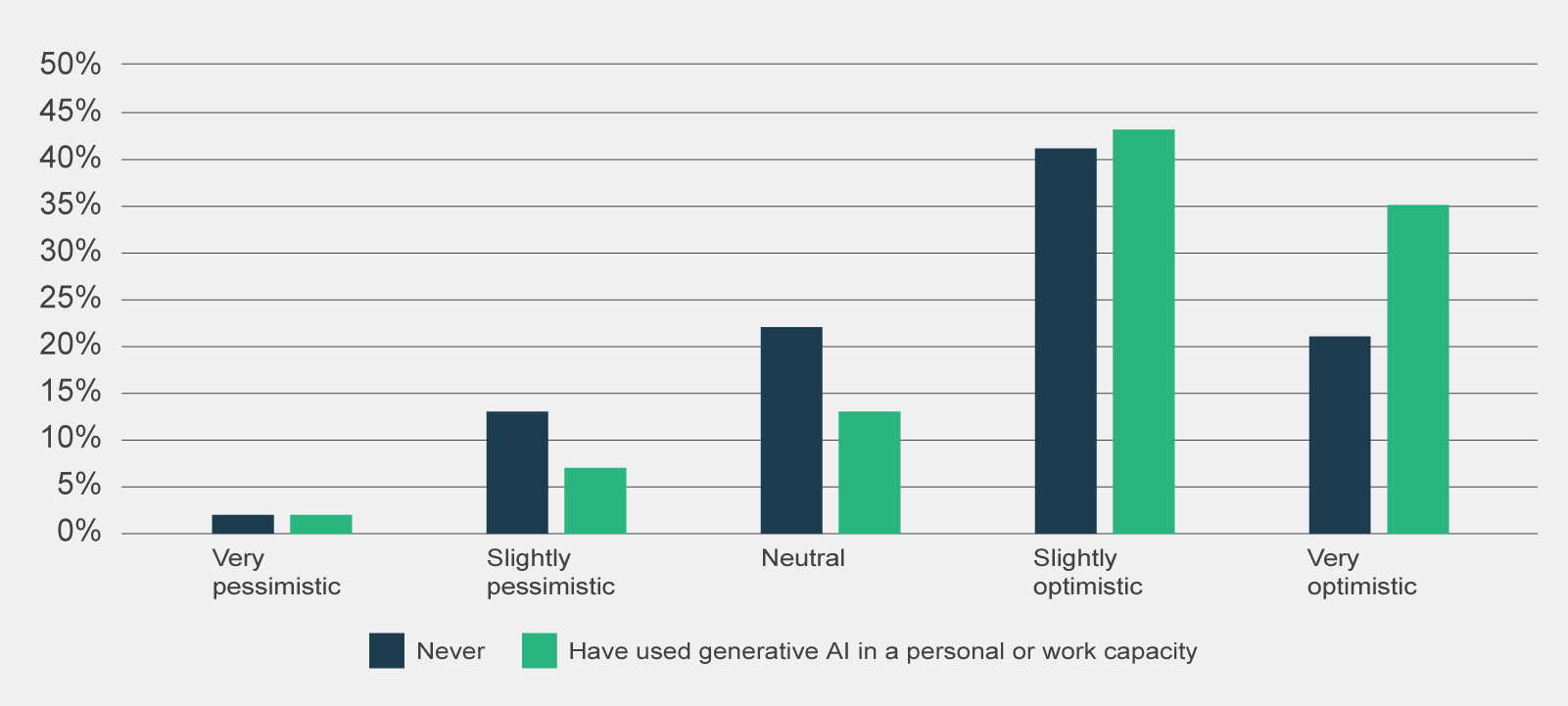
Data table for figure 16
Pre-use survey responses to 'Which of the following best describes your sentiment about using Copilot?', by prior experience with generative AI (n=1,386).
| Experience with generative AI | Very pessimistic | Slightly pessimistic | Neutral | Slightly optimistic | Very optimistic |
|---|---|---|---|---|---|
| Never | 2% | 13% | 22% | 41% | 21% |
| Have used generative AI in a personal or work capacity | 2% | 7% | 13% | 43% | 35% |
Totals may amount to less or more than 100% due to rounding.
OffThere was an inconsistent rollout of Copilot across agencies.
The experience and sentiment of trial participants may be affected by when their agency began participating in the trial and what version of Copilot their agency provided.
On the former, agencies received their Copilot licences between 1 January to 1 April 2024. Some agencies opted to distribute Copilot licences to participants later in this period once internal security assessments were complete. This meant that agencies participating in the trial had different timeframes to build capability and identify Copilot use cases, which could potentially affect participants’ overall sentiment and experience with Copilot.
Further, agencies who joined the trial later may not have been able to contribute to early evaluation activities, such as the pre-use survey or initial interviews, therefore excluding their perspective and preventing later comparison of outcomes.
On the latter, since the trial began, Microsoft has released 60 updates for Copilot to enable new features – including rectifying early technical glitches. Due to either information security requirements or a misalignment between agency update schedules, the new features of Copilot may have been inconsistently adopted across participating agencies or at times, not at all.
This means that there could be significant variability with Copilot functionality across trial participants and it is difficult for the evaluation to discern the extent to which participant sentiments are due to specific agency settings or Copilot itself.
Trial participants expressed a level of evaluation fatigue.
Agencies were encouraged to undertake their own evaluations to ensure the future adoption of Copilot or generative AI reflected their agency’s needs. Many participating agencies conducted internal evaluations of Copilot that involved surveys, interviews and productivity studies.
Decreasing rates of evaluation activity participation over the trial indicates that trial participants may have become fatigued from evaluation activities. The survey response rate progressively decreased across the pre-use to pulse to post-use surveys. Lower response rates in the post-use survey (n = 831) and for those who completed both the pre-use and post-use survey (n = 330) may impact how representative the data is of the trial population. Participation in the Nous-facilitated focus groups and the post-use survey was impacted by these parallel initiatives and the subsequent evaluation fatigue.
This means that the evaluation may not have been able to engage with a wide range of trial participants with a proportion of trial participants opting to only provide responses to their own agency evaluation. This may have been mitigated to a degree with some agencies sharing their results to the evaluation.
The impact of Copilot relied on trial participants’ self-assessment of productivity benefits.
The evaluation methodology relies on the trial participants’ self-assessed impacts of Copilot which may naturally under or overestimate impacts – particularly time savings. Where possible, the evaluation has compared its productivity findings against other APS agency evaluations and external research to verify the productivity savings put forth by trial participants.
Nevertheless, there is a risk that the impact of Copilot – in particular the productivity estimates from Copilot use, may not accurately reflect Copilot’s actual productivity impacts.
2.1 Problem definition
Clearly and concisely identify the problem you are trying to solve. Use 100 words or less.
2.2 AI use case purpose
Clearly and concisely describe the purpose of your use of AI, focusing on how it will address the problem you have identified. Use 200 words or less.
2.3 Non-AI alternatives
Briefly outline nonAI alternatives that could address this problem. Use 100 words or less.
2.4 Identifying stakeholders
Identify stakeholder groups that may be affected by the AI use case and briefly describe how they may be affected, whether positively or negatively. This will guide your consideration of expected benefits and potential risks in this assessment.
Consider holding a brainstorm or workshop to help identify affected stakeholders and how they may be affected. A discussion prompt is provided in the guidance document.
2.5 Expected benefits
Considering the stakeholders identified in the previous question, identify the expected benefits of the AI use case. This should be supported by quantitative and/or qualitative analysis.
Qualitative analysis should consider whether there is an expected positive outcome and whether AI is a good fit to accomplish the relevant task, particularly compared to nonAI alternatives identified. Benefits may include gaining new insights or data.
Consult the guidance document for resources to assist you. Aim for 300 words or less.