


Key insights
Most trial participants (77%) were satisfied with Copilot and wish to continue using the product.
The positive sentiment towards Copilot was not uniformly observed across all MS products or activities. In particular, MS Excel and Outlook Copilot functionality did not meet expectations.
Other generative AI tools may be more effective at meeting bespoke users’ needs than Copilot. In particular, Copilot was perceived to be less advanced in: writing and reviewing code, producing complex written documents, generating images for internal presentations, and searching research databases.
Despite the overall positive sentiment, the use of Copilot is moderate with only a third of post-use survey respondents using Copilot on a daily basis. Due to a combination of user capability, perceived benefit of the tool and convenience, and user interface, Copilot is yet to be ingrained in the daily habits of APS staff.
Copilot is currently used mainly for summarisation and re-writing content in Teams and Word.
There was a positive relationship between the provision of training and capability to use Copilot. Copilot training was most effective when tailored to the APS, the users’ role and the agency context.
There are opportunities to further enhance the use of generative AI across the policy lifecycle to increase adoption and benefits of generative AI.
Trial participants also remarked on the ability to spend more time on face-to-face activities such as staff engagement, culture building, mentoring and taking more time to build relationships with end users and stakeholders. Acknowledging the human dependent nature of these tasks, these respondents redistributed their time into face-to-face activities such as communications to support their team and/or customers.
The quality of Copilot output limited the scale of productivity benefits.
Contextual irrelevance impacted the quality of Copilot outputs.
Overall, Copilot’s improvements to work quality were more subdued than improvements to work efficiency. As highlighted in Figure 14, while the majority of trial participants viewed that Copilot was effective at developing first drafts of documents and lifting overall quality, editing was almost always needed to tailor content for the audience or context thereby reducing total efficiency gains.
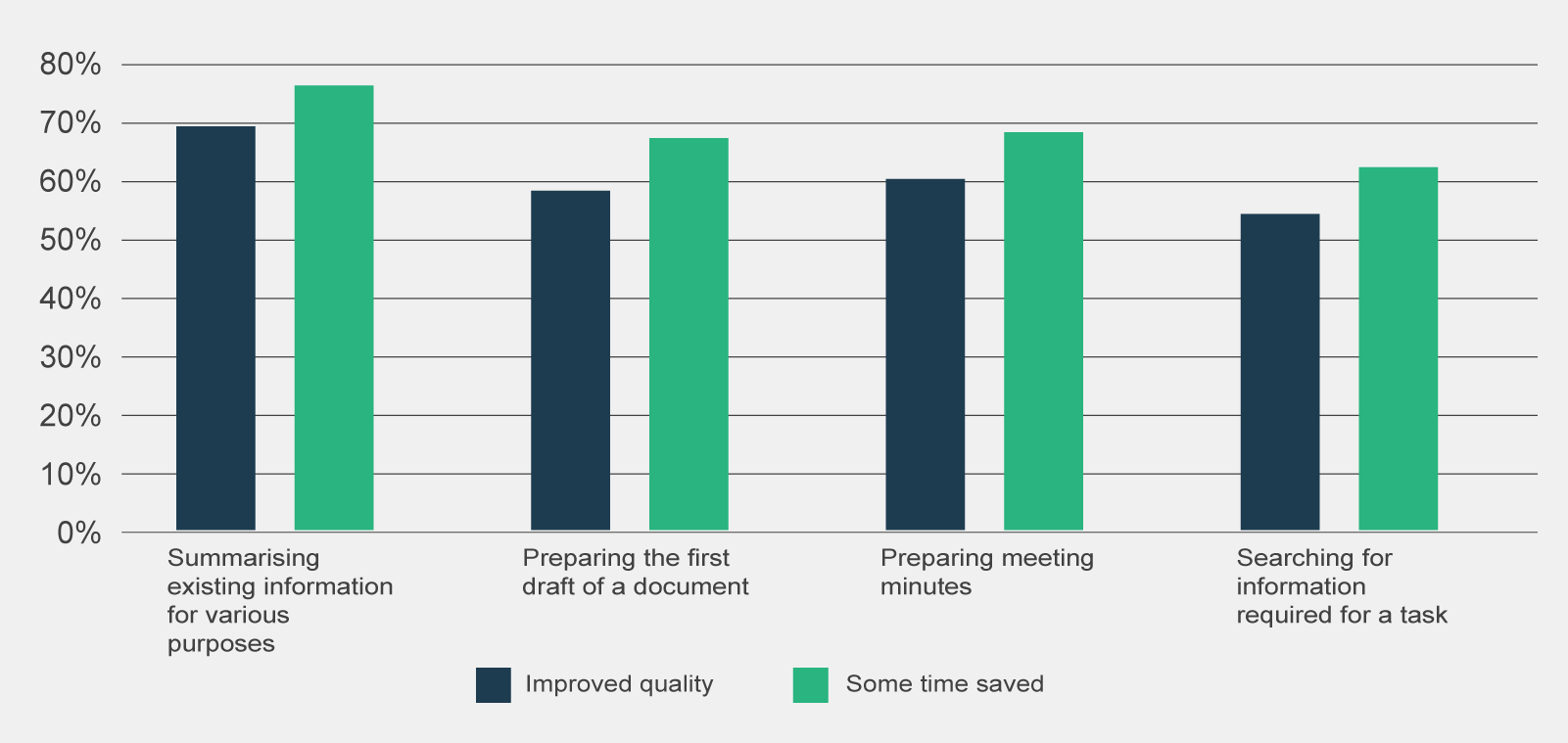
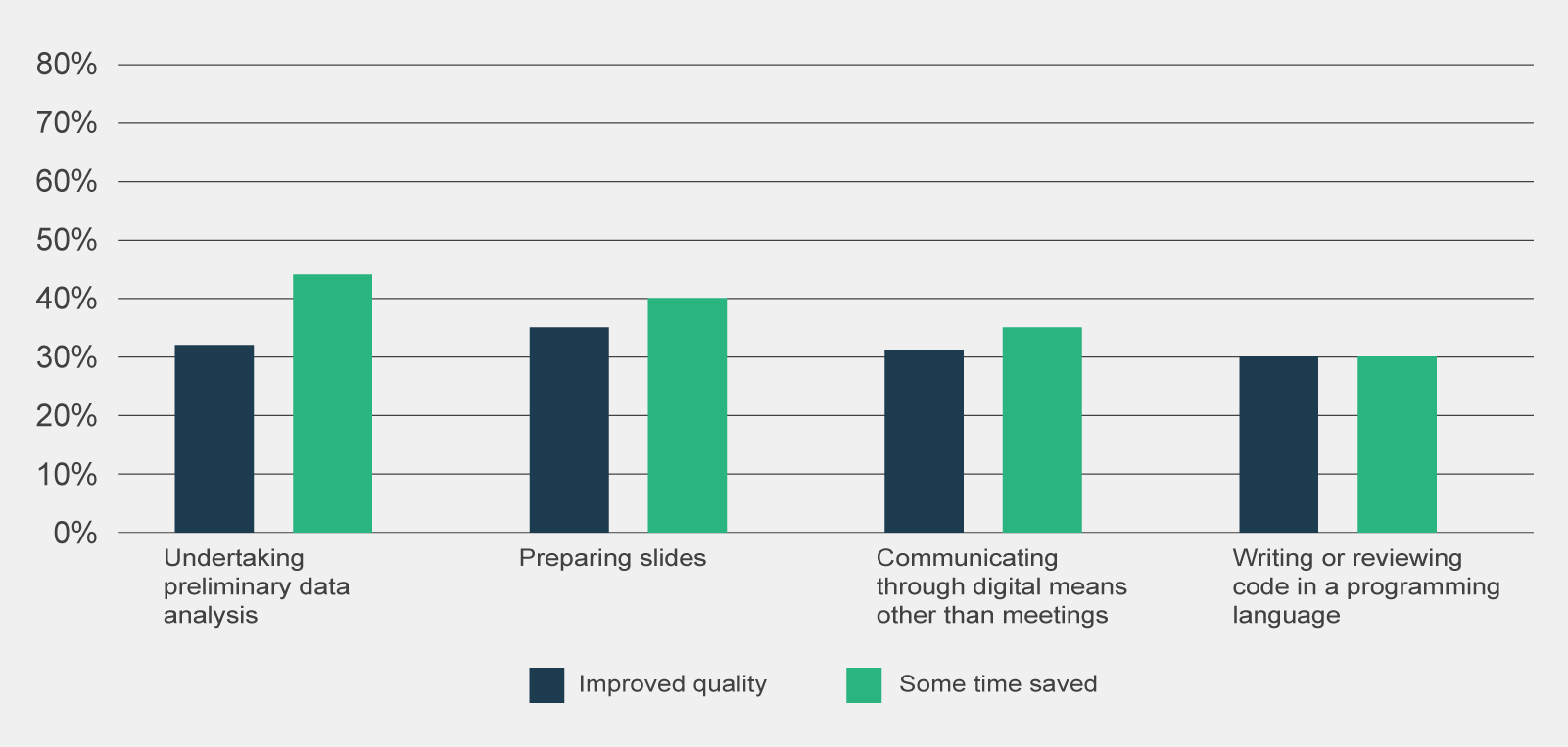
Figure 14 | Post-use survey responses reporting time savings of 0.5 hours or more (n=795) and overall agreement of improved quality of work (n=801), by type of activity
Most focus group participants reported they experienced inaccuracies or hallucinations in Copilot outputs during the trial. These inaccuracies typically materialised in the form of believable but ill-informed statements.
Focus group participants viewed that the search functionality through the Teams chat would often retrieve outdated or irrelevant documents. They also noted that Copilot could not prioritise retrieval of documents developed by their team or department, often surfacing documents from across the entire organisation.
Focus group participants also noted that while Copilot attaches sources to its outputs, this is currently limited to 3 documents and does not provide visibility on why the documents were selected. Observations from Home Affairs also identified that Copilot appeared to be unreliable in its approach to referencing information provided against data sources (Department of Home Affair 2024:10).
The potential inaccuracy of Copilot represents a large reputational risk to the APS with thorough quality assurance processes needed to mitigate risks of inaccurate information in Copilot outputs. However, it is likely the additional need of quality assurance processes will reduce the productivity benefits of Copilot.
References
- Australian Taxation Office (2024) ‘M365 Copilot Trial Update’, Australian Taxation Office, Canberra, ACT, 3.
- Department of Home Affairs (2024) ‘Copilot Hackathon’, Department of Home Affairs, Canberra, ACT, 10.
- Department of Industry, Science and Resources (2024) ‘DISR Internal Mid-trial Survey Insights’, Department of Industry, Science and Resources, Canberra, ACT, 6.
1. Basic information
1.1 AI use case profile
This section is intended to record basic information about the AI use case.
Name of AI use case
Choose a clear, simple name that accurately conveys the nature of the use case.
Reference number
Assign a unique reference number for your assessment. Unless otherwise advised by your agency or the Digital Transformation Agency (DTA), we recommend using an abbreviation of your agency’s name followed by the date (YYMMDD) that work first began on this assessment and a sequence number if multiple assessments start on the same day. This is intended to assist with internal record keeping and engagement with the DTA.
Lead agency
This should be the agency with primary responsibility for the AI use case. Where 2 or more agencies are jointly leading, nominate one as the contact point for the assessment.
Assessment contact officer
This should be the officer with primary responsibility for the completion and accuracy of the AI assurance assessment.
Executive sponsor
This should be the SES officer with primary responsibility for reviewing and signing off on the AI use case assessment.
AI use case description
Briefly explain how you are using or intending to use AI. This should be targeted at the level of an ‘elevator pitch’ that gives the reader a clear idea of the kind of AI use intended, without going into unnecessary technical detail. You may wish to include a high‑level description of the problem that the AI use case is trying to solve, the way AI will be used and the outcome it is intended to achieve (drawing on your answers in section 2). Use simple, clear language, avoiding technical jargon where possible.
Type of AI technology
Briefly explain what type of AI technology you are using or intend to use (for example, supervised or unsupervised learning, computer vision, natural language processing, generative AI).
While this may require a more technical answer than the use case description, aim to be clear and concise with your answer and use terms that a reasonably informed person with experience in the AI field would understand.
1.2 Lifecycle stage
The lifecycle stages and the guidance below are adapted from the OECD’s definition of the AI system lifecycle.
Early experimentation
Intended to cover experimentation which does not:
- commit you to proceeding with a use case or to any design decisions that would affect implementation later
- commit you to expending significant resources or time
- risk harming anyone
- introduce or exacerbate any privacy or cybersecurity risks
- produce outputs that will form the basis of policy advice, service delivery or regulatory decisions.
Design, data and models
A context-dependent phase encompassing planning and design, data collection and processing, and model building.
‘Planning and design of an AI system’ involves articulating the system’s concept and objectives, underlying assumptions, context and requirements and potentially building a prototype.
‘Data collection and processing’ includes gathering and cleaning data, performing checks for completeness and quality, documenting metadata and characteristics of the data set.
‘Model building and interpretation’ involves the creation, adaptation or selection of models and algorithms, their calibration and/or training and interpretation.
Verification and validation
Involves executing and tuning models, with tests to assess performance across various dimensions and considerations.
Deployment
Into live productions involves piloting, checking compatibility with legacy systems, managing organisational change and evaluating user experience.
Operation and monitoring
Involves operating the AI system and continuously assessing the recommendations and impacts (intended and unintended) in light of objectives and ethical considerations. This phase identifies problems and adjusts by reverting to other phases or, if necessary, retiring an AI system from production.
Retirement
Involves ceasing operation or development of a system and may include activities such as evaluation, decommissioning and data migration.
These phases are often iterative and not necessarily sequential. The decision to retire an AI system from operation may occur at any point in the operation and monitoring phase.
1.3 Review date
Include the estimated date when this assessment will next need to be reviewed. For example, ‘Moving to deployment – Q3 2026’.
The triggers for a review are:
- an AI use case moving to a different stage of its lifecycle (for example, from ‘design, data and models’ to ‘verification and validation’)
- a significant change to the scope, function or operational context of the use case.
Agencies may choose to conduct reviews at regular intervals even if the above review triggers have not been met, in line with internal policies and risk tolerance. For assistance in determining the next appropriate review date, consult the DTA.
1.4 Assessment review history
For each review of the assessment, record the review date and summarise the change or changes arising from the review.
AI use cases covered by this framework
In determining whether an AI use case meets this framework’s definition of a ‘covered AI use case’, you may wish to refer to the risk consequence and risk likelihood rating advice attached to this guidance to assist you in considering whether the use of AI could ‘materially influence’ a decision leading to more than insignificant harm.
A decision may be considered ‘materially influenced’ by an AI system if:
- the decision was automated by an AI system, with little to no human oversight
- a component of the decision was automated by an AI system, with little to no human oversight (for example, a computer makes the first 2 limbs of a decision, with the final limb made by a human)
the AI system is likely to influence decisions that are made (for example, the output of the AI system recommended a decision to a human for consideration or provided substantive analysis to inform a decision).
Off
AI use cases covered by this framework
In determining whether an AI use case meets this framework’s definition of a ‘covered AI use case’, you may wish to refer to the risk consequence and risk likelihood rating advice attached to this guidance to assist you in considering whether the use of AI could ‘materially influence’ a decision leading to more than insignificant harm.
A decision may be considered ‘materially influenced’ by an AI system if:
- the decision was automated by an AI system, with little to no human oversight
- a component of the decision was automated by an AI system, with little to no human oversight (for example, a computer makes the first 2 limbs of a decision, with the final limb made by a human)
- the AI system is likely to influence decisions that are made (for example, the output of the AI system recommended a decision to a human for consideration or provided substantive analysis to inform a decision).
2. Purpose and expected benefits
2.1 Problem definition
Describe the problem that you are trying to solve.
For example, the problem might be that your agency receives a high volume of public submissions, and that this volume makes it difficult to engage with the detail of issues raised in submissions in a timely manner.
Do not describe how you plan to fix the problem or how AI will be used.
Though ‘problem’ implies a negative framing, the problem may be that your agency is not able to take full advantage of an opportunity to do things in a better or more efficient way.
2.2 AI use case purpose
Clearly and concisely describe the purpose of your use of AI, focusing on how it will address the problem you described at 2.1.
Your answer may read as a positive restatement of the problem and how it will be addressed.
For example, the purpose may be to enable you to process public submissions more efficiently and effectively and engage with the issues that they raise in more depth.
2.3 Non‑AI alternatives
Briefly outline non‑AI alternatives that could address the problem you described at 2.1.
Non‑AI alternatives may have advantages over solutions involving AI. For example, they may be cheaper, safer or more reliable.
Considering these alternatives will help clarify the benefits and drawbacks of using AI and help your agency make a more informed decision about whether to proceed with an AI‑based solution.
2.4 Identifying stakeholders
Conduct a mapping exercise to identify the individuals or groups who may be affected by the AI use case. Consider holding a workshop or brainstorm with a diverse team to identify the different direct and indirect stakeholders of your AI use case.
The list below may help generate discussion on the types of stakeholder groups to consider. Please note the stakeholder types below have been provided as a prompt to aid discussion and is not intended as a prescriptive or comprehensive list.
For each type, identify the use case stakeholders and how they might be affected (positively or negatively).
End users
People who will use the AI system and/or interpret its outputs.
Evaluation or decision subjects
People or groups who will be evaluated or monitored by the system (e.g. who the system is making predictions or recommendations about).
Oversight team
The person or team who is managing, operating, overseeing or controlling and monitoring the system during and after deployment.
System owner or deployer
The executive executives responsible for making decisions on whether to use a system for a particular use.
AI model or AI system engineers
Those involved in AI model or system design, development and maintenance.
Rights holders
Those who hold the rights to materials used by AI (e.g. copyright owners or creators).
Malicious actors
Those who may intentionally misuse the system.
Bystanders
Those in vicinity of system that may be impacted.
Regulators and civil society organisations
Those who regulate, advocate for regulation, or are concerned about compliance.
Communities, or groups
Communities who are likely to be affected by the use of the system.
Associated parties
Third parties impacted by an evaluation or decision and other stakeholders who may have an interest in the use of the system based on their relationship to other stakeholders.
Non-end-user APS staff
APS staff whose roles and workflows will be affected by AI but are not end users of your AI use case.
Intermediaries
A facilitator or agent between 2 parties whose role may evolve with AI integration (e.g. tax agents).
2.5 Expected benefits
This section requires you to explain the expected benefits of the AI use case, considering the stakeholders identified in the previous question.
This analysis should be supported by specific metrics or qualitative analysis. Metrics should be quantifiable measures of positive outcomes that can be measured after the AI is deployed to assess the value of using AI. Any qualitative analysis should consider whether there is an expected positive outcome and whether AI is a good fit to accomplish the relevant task, particularly when compared to the non‑AI alternatives you identified previously. Benefits may include gaining new insights or data.
Consider consulting the following resources for further advice
3. Threshold assessment
3.1 Threshold assessment process
To complete the threshold assessment, follow these steps.
3.1.1 Determine likelihood and consequence
For each risk category listed in the assessment, determine the likelihood and consequence of the risk occurring for your AI use case. You should consult the likelihood and consequence descriptors at the Attachment to this guidance.
The risk assessment should reflect the intended scope, function and risk controls of the AI use case.
In conducting your assessment, you should be clear on:
- key factors contributing to the likelihood and consequence of the risk
- how any existing or planned risk controls contribute to the likelihood and consequence of the risk
- any assumptions or uncertainties affecting your risk assessment.
3.1.2 Determine risk severity
Use the risk matrix provided in the framework and at the attachment to this guidance to determine the risk severity for each category.
3.1.3 Provide explanations
In the ‘rationale’ column, provide a clear and concise explanation for each risk rating (aim for no more than 200 words per risk but use additional words if necessary).
You should cover the factors, controls and assumptions outlined above at step 1.
3.2 Assessment contact officer recommendation
Once completed, if the Assessment Contact Officer is satisfied that all risks are low, they may recommend that a full assessment is not required and that the executive sponsor accept the low risks and endorse the use case. If one or more risks are medium or higher, the assessment contact officer must either:
- complete a full assessment
- amend the scope, function or risk controls to a point where the threshold assessment results in a low risk rating
- decide to not accept the risk and not proceed with the AI use case.
3.3 Executive sponsor review
Once the assessment contact officer has made their recommendation, the executive sponsor must:
- review the recommendation
- confirm whether they are satisfied by the supporting analysis
- agree that a full assessment is or is not necessary for the use case.
When completing the threshold assessment, keep in mind the following:
- Try to be objective and honest in your assessment of risks. Underestimating risks at this stage could lead to inadequate risk management.
- Determining risk ratings can be challenging. Seek guidance from others to assist you (especially subject matter experts and those experienced in safe and responsible AI risk assessments).
- Consider the perspectives of stakeholders, including those identified at section 2.4, in assessing the likelihood and consequence of risks.
- Ensure you consider the perspectives of marginalised groups, including First Nations people, especially in relation to the risks relating to discrimination and stereotyping. You may not have the background or life experience to fully appreciate these risks.
- Where there is uncertainty or disagreement about the appropriate risk severity rating, err on the side of caution and choose the higher rating.
- Document key assumptions or evidence used in determining the risk severity ratings, as this will help explain the rationale for your assessment to reviewers.
- Consider the expected benefits of the AI use case before deciding whether to proceed based on significant but mitigable risks.
4. Fairness
4.1 Defining fairness
Fairness is a core principle in the design and use of AI systems, but it is a complex and contextual concept. Australia’s AI Ethics Principles state that AI systems should be inclusive and accessible and should not involve or result in unfair discrimination. However, there are different and sometimes conflicting definitions of fairness, and people may disagree on what is fair.
For example, there is a distinction between individual fairness (treating individuals similarly) and group fairness (similar outcomes across different demographic groups). Different approaches to fairness involve different trade‑offs and value judgments. The most appropriate fairness approach will depend on the specific context and objectives of your AI use case.
When defining fairness for your AI use case, you should be aware that AI models are typically trained on broad sets of data that may contain bias. Bias can arise in data where it is incomplete, unrepresentative or reflects societal prejudices. AI models may reproduce biases present in the training data, which can lead to misleading or unfair outputs, insights or recommendations.
This may disproportionally impact some groups, such as First Nations people, people with disability, LGBTIQ+ communities and multicultural communities. For example, an AI tool used to screen job applicants might systematically disadvantage people from certain backgrounds if trained on hiring data that reflects past discrimination.
When defining fairness for your AI use case, it is recommended that you:
- consult relevant domain experts, affected parties and stakeholders (such as those you have identified at section 2.4) to help you understand the trade‑offs and value judgements that may be involved
- document your definition of fairness in your response to section 4.1, including how you have balanced competing priorities and why you believe it to be appropriate to your use case
- be transparent about your fairness definition and be open to revisiting it based on stakeholder feedback and real‑world outcomes.
You should also ensure that your definition of fairness complies with anti‑discrimination laws. In Australia, it is unlawful to discriminate on the basis of a number of protected attributes including age, disability, race, sex, intersex status, gender identity and sexual orientation in certain areas of public life, including education and employment. Australia’s federal anti‑discrimination laws are contained in the following legislation:
- Age Discrimination Act 2004
- Disability Discrimination Act 1992
- Racial Discrimination Act 1975
- Sex Discrimination Act 1984.
Resources
- Resources on fairness in AI from the OECD Catalogue of Tools & Metrics for Trustworthy AI
- Fairness Assessor Metrics Pattern from the CSIRO Data61 Responsible AI Pattern Catalogue
4.2 Measuring fairness
You may be able to use a combination of quantitative and qualitative approaches to measuring fairness. Quantitative fairness metrics can allow you to compare outcomes across different groups and assess this against fairness criteria. Qualitative assessments, such as stakeholder engagement and expert review, can provide additional context and surface issues that metrics alone might miss.
Quantifying fairness
The specific quantitative metrics you use to measure fairness will depend on the definition of fairness you have adopted for your use case. When selecting fairness metrics, you should:
- choose metrics that align with your fairness definition, recognising the trade‑offs between different fairness criteria and other objectives like accuracy
- confirm whether you have appropriate data to assess those metrics, including sensitive attributes where appropriate (see Australian Privacy Principles 3.3)
- set clear and measurable acceptance criteria (see guidance for 5.4)
- establish a plan for monitoring these metrics (see 5.6) and processes for remediation, intervention or safely disengaging the AI system if those thresholds are not met.
For examples of commonly used fairness metrics, see the Fairness Assessor Metrics in CSIRO Data61’s Responsible AI Pattern Catalogue.
Qualitatively assessing fairness
Consider some of these qualitative approaches, which may be useful to overcome data limitations and to surface issues that metrics may overlook.
Stakeholder engagement
Consult affected communities, stakeholders and domain experts to understand their perspectives and identify potential issues.
User testing and feedback
Test your AI system with diverse users and solicit their feedback on the fairness and appropriateness of the system’s outputs. Seek out the perspectives of marginalised groups and those groups that may be impacted by the AI system.
Expert review
Engage experts, such as AI ethicists or accessibility and inclusivity specialists, to review the fairness of your system’s outputs and the overall fairness approach and identify potential gaps or unintended consequences.
Resources
- Implementing Australia’s AI Ethics Principles: provides tools and techniques for measuring and minimising bias in AI systems
- List of fairness metrics at Supplementary Table 1 of the research paper A translational perspective towards clinical AI fairness
- Resources on fairness in AI from the OECD Catalogue of Tools & Metrics for Trustworthy AI
- Fairness Assessor Metrics Pattern from the CSIRO Data61 Responsible AI Pattern Catalogue
5. Reliability and safety
5.1 Data suitability
The data used to operate, train and validate your AI system has a significant impact on its performance, fairness and safety. In your answer to this question, explain why the chosen data is suitable for your use case. Some relevant considerations are outlined below.
When choosing between datasets, consider whether the data can be disaggregated by marginalised groups, particularly by Indigeneity. If the data is Indigenous data, you should refer to the guidelines in the Framework for Governance of Indigenous Data (see section 5.2 below).
Data quality should be assessed prior to use in AI systems. Agencies should select applicable metrics to determine a data set’s quality and identify any remediation required before using it for training or validation in AI systems. Suggested relevant metrics to consider include relevance, accuracy, completeness, timeliness, validity and lack of duplication. One method to ensure good quality data is to set minimum thresholds appropriate to specific use cases, such as through acceptance criteria discussed below at 5.4. An example of a specific framework for determining data quality in statistical uses is the ABS Data Quality Framework.
Where third party material or data is being used to operate, train or validate an AI system, agencies should assess the data and the AI system for copyright concerns due to the potential for copying or transforming material that is protected by copyright or broader intellectual property laws.
You should also consider:
Data provenance
Involves creating an audit trail to assign custody and trace accountability for issues. It provides assurance of the chain of custody and its reliability, insofar as origins of the data are documented.
Data lineage
Involves documenting data origins and flows to enable stakeholders to better understand how datasets are constructed and processed. This fosters transparency and trust in AI systems.
Data volume
Consider the volume of data you need to support the operation, training and validation of your AI system.
5.2 Indigenous data
Describe how any components of your AI system have used or will use Indigenous data, or where any outputs relate to Indigenous individuals, communities or groups.
All Australian Public Service (APS) agencies are required to implement the Framework for Governance of Indigenous Data (GID). The GID adopts the definition of ‘Indigenous data’ as provided by Maiam nayri Wingara Indigenous Data Sovereignty Collective:
Information or knowledge, in any format or medium, which is about and may affect Indigenous peoples both collectively and individually.
If the data used to operate, train or validate your AI system, or any outputs from your AI system, are Indigenous data in line with the Maiam nayri Wingara definition above, you should refer to the guidelines in the GID.
This includes applying the principles of respect for cultural heritage, informed consent, privacy (including collective or group privacy) and trust, to all stages of the ‘Data Lifecycle’. These concepts, including the FAIR (Findable, Accessible, Interoperable, and Reusable) and CARE (Collective Benefit, Authority to Control, Responsibility, Ethics) principles, are described in the GID.
Relevant practices to consider in this context include:
- Checking if datasets used to train the AI included diverse and representative samples of cultural expression, artifacts, languages and practices. This supports the AI system being able to recognise and appropriately respond to a greater range of cultural contexts in a less biased manner.
- Describing any mechanisms in place for engaging with Indigenous individuals, communities or group representatives and collecting and incorporating their feedback on the AI system’s performance, especially regarding cultural aspects.
- Describing processes to review documentation and protocols that ensure the project has incorporated the GID principles. Look for evidence of meaningful engagement with and input from suitably qualified and experienced Indigenous individuals, communities and groups. Assess if the system includes features or options that allow Indigenous stakeholders to control how their data is used and represented and describe how benefits of the project to First Nations Peoples, to which the data relate, have been considered.
5.3 Suitability of procured AI model
Also consider the use of Indigenous data in the context of the United Nations Declaration on the Rights of Indigenous Peoples and apply the concept of ‘free, prior and informed consent’ in relation to the use of Indigenous data in AI systems.
If you are procuring an AI model (or system) from a third‑party provider, your procurement process should consider whether the provider has appropriate data management (including data quality and data provenance), governance, data sourcing, privacy, security, intellectual property, and cybersecurity practices in relation to the model. This will help you to identify whether the AI model is fit for the context and purpose of your AI use case.
The relevance of the data used in training the AI model may influence the output and may not be relevant to the use case (and Australian context). Consider whether the model is likely to make accurate or reliable predictions concerning matters relating to Australian subject matter if it has been trained on, for example, US‑centric data.
In addition, there are a number of other considerations you should take into account when selecting a procured AI model. The following considerations may be relevant to your use case.
- Does the AI model meet the functional requirements needed for your use case?
- How was the model evaluated? What test data and benchmarks were used?
- How is versioning for the AI model handled?
- What support does the provider provide for users/procurers?
- What provisions apply regarding potential liability issues? If the product fails, is accountability clear between your agency and the provider?
- What security precautions have been taken? What residual risks remain and how are these being mitigated?
- Are there any guarantees that data handling and management (for the entire lifecycle of the data) for the procured model meet internal agency and legislative requirements? What guarantees are there regarding the robustness of the model?
- What measures have been taken to prevent or reduce hallucinations, unwanted bias and model drift?
- Is the explainability and interpretability of the model sufficient for your use case?
- What computing and storage capacities are necessary for operating the model on‑premises?
- What capability is needed to maintain the AI model? Can this be done in‑house, or will this need to be sourced externally?
- If you are considering using a platform as a service (PaaS) to run and support your AI system or AI model, have you considered risks associated with outsourcing?
5.4 Testing
Consider also how your agency will support transparency across the AI supply chain, for example, by notifying the developer of issues encountered in using the model or system.
Testing is a key element for assuring the responsible and safe use of AI models – for both models developed in-house and externally procured – and in turn, of AI systems. Rigorous testing helps validate that the system performs as intended across diverse scenarios. Thorough and effective testing helps identify problems before deployment.
Testing AI systems against test datasets can reveal biases or possible unintended consequences or issues before real-world deployment. Testing on data that is limited or skewed can fail to reveal shortcomings.
Consider establishing clear and measurable acceptance criteria for the AI system that, if met, would be expected to control harms that are relevant in the context of your AI use case. Acceptance criteria should be specific, objective and verifiable. They are meant to specify the conditions under which a potential harm is adequately controlled.
Consider developing a test plan for the acceptance criteria to outline the proposed testing methods, tools and metrics. Documenting results through a test report will assist with demonstrating accountability and transparency. A test report could include the following:
- a summary of the testing objectives, methods and metrics used
- results for each test case
- an analysis of the root causes of any identified issues or failures
- recommendations for remediation or improvement, and whether the improvements should be done before deployment or as a future release.
In your explanation, outline any areas of concern in results from testing. If you have not started testing, outline elements to be considered in testing plans.
Model accuracy
As an example. model accuracy is a key metric for evaluating the performance of an AI system. Accuracy should be considered in the specific context of the AI use case, as the consequences of errors or inaccuracies can vary significantly depending on the domain and application.
Some of the factors that can influence AI model output accuracy and reliability include:
- choice of AI model or model architecture
- quality, accuracy and representativeness of training data
- presence of bias in the training data or AI model
- robustness to noise, outliers and edge cases
- ability of the AI model to generalise to new data
- potential for errors or ‘hallucinations’ in outputs
- environmental factors (such as lighting conditions for computer vision systems)
- adversarial attacks (such as malicious actors manipulating input data to affect outputs)
- stability and consistency of performance over time.
Ways to assess and validate the accuracy of your model for your AI use case include:
- quantitative metrics
- qualitative analysis (for example, manual review of output, error analysis, user feedback)
- domain-specific benchmarks or performance standards
- comparison to human performance or alternative models.
5.5 Pilot
It is important to set accuracy targets that are appropriate for the risk and context of the use case. For high stakes decisions, you should aim for a very high level of accuracy and have clear processes for handling uncertain or borderline cases.
Conducting a pilot study is a valuable way to assess the real-world performance and impact of your AI use before full deployment. A well-designed pilot can surface issues related to reliability, safety, fairness and usability that may not be apparent in a controlled development environment.
If you are planning a pilot, your explanation should provide a brief overview of the pilot's:
- scope and duration
- objectives and key results (OKRs)
- key performance indicators (KPIs)
- participant selection and consent process
- risk mitigation strategies.
5.6 Monitoring
If you have already completed a pilot, reflect on the key findings and lessons learned. How did the pilot outcomes compare to your expectations? What issues or surprises emerged? How did you adapt your AI use case based on the pilot results?
If you are not planning to conduct a pilot, explain why not. Consider whether the scale, risk or novelty of your use case warrants a pilot phase. Discuss alternative approaches you are taking to validate the performance of your AI use case and gather user feedback prior to full deployment.
Monitoring is key to maintaining the reliability and safety of AI systems over time. It enables active rather than passive oversight and governance.
Your monitoring plan should be tailored to the specific risks and requirements of your use case. In your explanation, describe your approach to monitoring any measurable acceptance criteria (as discussed above at 5.4) as well as other relevant metrics such as performance metrics or anomaly detection. In your plan, you should include your proposed monitoring intervals for your use case. Consider including procedures for reporting and learning from incidents. You may wish to refer to the OECD paper on Defining AI incidents and related terms.
Periodically evaluate your monitoring and evaluation mechanisms to ensure they remain effective and aligned with evolving conditions throughout the lifecycle of your AI use case. Examples of events that could influence your monitoring plan are system upgrades, error reports, changes in input data, performance deviation or feedback from stakeholders.
Monitoring can help identify issues that can impact the safety and reliability of your AI system, such as concept or data drift.
- Concept drift refers to a change in the relationship between input data and the feature being predicted
- Data drift refers to a change in input data patterns compared to the data used to train the model
Vendors offer monitoring tools that may be worth considering for your use case. For more information, see pp. 26-27 of the NAIC’s Implementing Australia’s AI Ethics Principles report.
5.7 Preparedness to intervene or disengage
Relevant stakeholders, including those who operate, use or interact with the AI system, those who monitor AI system performance, and affected stakeholders identified at section 2.4, should have the ability to raise concerns about insights or decisions informed by the AI system.
Agencies should develop clear escalation processes for raising concerns, such as designated points of contact, guidelines and criteria for when human intervention is necessary and timelines for response and resolution. Agencies should also consider documenting and reviewing any interventions that occur to ensure consistency and fairness.
In addition, agencies should be prepared to quickly and safely disengage an AI system when an unresolvable issue is identified. This could include a data breach, unauthorised access or system compromise. Consider such scenarios in business continuity, data breach and security response plans.
Agencies should consider the techniques below to avoid overreliance on AI system outputs.
System design stage
Build in transparency about system limitations
Incorporate prompts to remind users to critically analyse outputs, such as explanations of outputs, hallucination reminders, and accuracy scores.
Build in 2-way feedback pathways
Prompt users to assess the quality of the AI system’s outputs and provide feedback.
Similarly, provide feedback to users on their interactions with the systems (e.g. feedback on ineffective prompts, alerts when the user has accepted a risky decision).
Prompt human decisions
Consider designing your AI system to provide options for the user to choose from, rather than a single solution, to encourage user engagement with AI outputs.
Evaluation stage
Ensure regular evaluation
Involve users in regular evaluations of your AI system. Encourage users to assess the effectiveness of the AI system and identify areas for improvement.
6. Privacy protection and security
6.1 Minimise and protect personal information
Data minimisation
Data minimisation is an important consideration when developing and deploying AI systems for several reasons, including privacy and improving quality and model stability. In some cases, more data may be warranted (for example, some large language models) but it is important that you follow good practice in determining the data needed for your use case.
Privacy requirements for personal information under the Australian Privacy Principles (APPs) are an important consideration in responding to this question. Ensure you have considered your obligations under the APPs, particularly APPs 3, 6 and 11.
For more information, you should consult the APP guidelines, your agency’s internal privacy policy and resources and privacy officer.
Privacy enhancing technologies
Your agency may want or need to use privacy enhancing technologies to assist in de‑identifying personal information under the APPs or as a risk mitigation/trust building approach. Under the Privacy Act 1988 (Cth) and the APPs, where information has been appropriately de‑identified it is no longer personal information and can be used in ways that the Privacy Act would normally restrict.
The Office of the Australian Information Commissioner’s (OAIC) website provides detailed guidance on De-identification and the Privacy Act that agencies should consider. You may also wish to refer to the De-identification Decision-Making Framework, jointly developed by the OAIC and CSIRO Data61.
6.2 Privacy assessment
The Australian Government Agencies Privacy Code (the Privacy Code) requires Australian Government agencies subject to the Privacy Act 1988 to conduct a privacy impact assessment (PIA) for all ‘high privacy risk projects’. A project may be a high privacy risk if the agency reasonably considers that the project involves new or changed ways of handling personal information that are likely to have a significant impact on the privacy of individuals.
A Privacy Threshold Assessment (PTA) is a preliminary assessment to help you determine your project’s potential privacy impacts and give you a sense of the risk level, including whether it could be a ‘high privacy risk project’ requiring a PIA under the Code.
This assurance framework does not determine the timing for conducting a PIA or PTA – it may be appropriate that you conduct a PIA or PTA earlier than your assessment of the AI use case under this framework.
If no PIA or PTA has been undertaken, explain why and what consideration there has been of potential privacy impacts.
Privacy assessments should consider if relevant individuals have provided informed consent, where required, to the collection, sharing and use of their personal information in the AI system’s training, operation or as an output for making inferences. Also consider how any consent obtained, including a description of processes used to obtain the consent, has been recorded.
For more information, you should consult the guidance on the Office of the Australian Information Commissioner’s website. You can also consult your agency’s privacy officer and internal privacy policy and resources.
If your AI system has used or will use Indigenous data, you should also consider whether notions of ‘collective’ or ‘group’ privacy of First Nations people are relevant and refer to the guidelines in the Framework for Governance of Indigenous Data (see 5.2).
6.3 Authority to operate
The Protective Security Policy Framework (PSPF) applies to non‑corporate Commonwealth entities subject to the Public Governance, Performance and Accountability Act 2013 (PGPA Act).
Refer to the relevant sections of the PSPF on safeguarding information and communication technology (ICT) systems to support the secure and continuous delivery of government business.
Under the PSPF, entities must effectively implement the Australian Government Information Security Manual (ISM) security principles and must only use ICT systems that the determining authority (or their delegate) has authorised to operate based on the acceptance of the residual security risks associated with its operation.
In addition, the Australian Signals Directorate’s Engaging with Artificial Intelligence guidance outlines mitigation considerations for organisations to consider. It is highly recommended that your agency engages with and implements the mitigation considerations in the guidance.
AI systems that have already been authorised or fall within existing authorisations by your agency’s IT Security Adviser (ITSA) do not have to be re‑authorised.
It is recommended you engage with your agency’s ITSA early to ensure all PSPF and ISM requirements are fulfilled.
7. Transparency and explainability
7.1 Consultation
You should consult with a diverse range of internal and external stakeholders at every stage of your AI system’s deployment to help identify potential biases, privacy concerns, and other ethical and legal issues present in your AI use case. This process can also help foster transparency, accountability, and trust with your stakeholders and can help improve their understanding of the technology’s benefits and limitations. Refer to the stakeholders you identified in section 2.4.
If your project has the potential to significantly impact Aboriginal and Torres Strait Islander peoples or communities, it is critical that you meaningfully consult with relevant community representatives.
Consultation resources
APS Framework for Engagement and Participation – sets principles and standards that underpin effective APS engagement with citizens, community and business and includes practical guidance on engagement methods.
Office of Impact Analysis Best Practice Consultation guidance note – provides a detailed explanation of the application of the whole-of-government consultation principles outlined in the Australian Government Guide to Policy Impact Analysis.
AIATSIS Principles for engagement in projects concerning Aboriginal and Torres Strait Islander peoples – provides non-Indigenous policy makers and service designers with the foundational principles for meaningfully engaging with Aboriginal and Torres Strait Islander peoples on projects that impact their communities.
7.2 Public visibility
Where appropriate, you should make the scope and goals of your AI use case publicly available. You should consider publishing relevant, accessible information about your AI use case in a centralised location on your agency website. This information could include:
- use case purpose
- overview of model and application
- benefits
- risks and mitigations
- training data sources
- compliance with the Policy for the responsible use of AI in government
- contact officer information.
Note: All agencies in scope of the Policy for the responsible use of AI in in government are required to publish an AI transparency statement. More information on this requirement can be found in the policy and associated guidance. You may wish to include information about your use case in your agency’s AI transparency statement.
Considerations for publishing
In some circumstances it may not be appropriate to publish detailed information about your AI use case. When deciding whether to publish this information you should balance the public benefits of AI transparency with the potential risks as well as compatibility with any legal requirements around publication.
For example, you may choose to limit the amount of information you publish or not publish any information at all if:
- the AI use case is still in the experimentation phase
- publishing may have negative implications for national security
- publishing may have negative implications for criminal intelligence activities
- publishing may significantly increase the risk of fraud or non-compliance
- publishing may significantly increase the risk of cybersecurity threats
- publishing may jeopardise commercial competitiveness.
7.3 Maintain appropriate documentation and records
You may also wish to refer to the exemptions under the Freedom of Information Act 1982 in considering whether it is appropriate to publish information about your AI use case.
Agencies should comply with legislation, policies and standards for maintaining reliable and auditable records of decisions, testing, and the information and data assets used in an AI system. This will enable internal and external scrutiny, continuity of knowledge and accountability. This will also support transparency across the AI supply chain – for example, this documentation may be useful to any downstream users of AI models or systems developed by your agency.
Agencies should document AI technologies they are using to perform government functions as well as essential information about AI models, their versions, creators and owners. In addition, artifacts used and produced by AI – such as prompts, inputs and raw outputs – may constitute Commonwealth records under the Archives Act 1983 and may need to be kept for certain periods of time identified in records authorities issued by the National Archives of Australia (NAA).
To identify their legal obligations, business areas implementing AI in agencies may want to consult with their information and records management teams. The NAA can also provide advice on how to manage data and records produced by different AI use cases.
The NAA Information Management Standard for Australian Government outlines principles and expectations for the creation and management of government business information. Further guidance relating to AI records is available on the NAA website under Information Management for Current, Emerging and Critical Technologies.
AI documentation types
Where suitable, you should consider creating the following forms of documentation for any AI system you build. If you are procuring an AI system from an external provider, it may be appropriate to request these documents as part of your tender process.
System factsheet/model card
A system factsheet (sometimes called a model card) is a short document designed to provide an overview of an AI system to non-technical audiences (such as users, members of the public, procurers, and auditors). These factsheets usually include information about the AI system’s purpose, intended use, limitations, training data, and performance against key metrics.
Examples of system factsheets include Google Cloud Model Cards and IBM AI factsheets.
Datasheets
Datasheets are documents completed by dataset creators to provide an overview of the data used to train and evaluate an AI system. Datasheets provide key information about the dataset including its contents, data owners, composition, intended uses, sensitivities, provenance, labelling and representativeness.
Examples of datasheets include Google’s AI data cards and Microsoft’s Aether Data Documentation template.
System decision registries
System decision registries record key decisions made during the development and deployment of an AI system. These registries contain information about what decisions were made, when they were made, who made them and why they were made (the decision rationale).
Examples of decision registries include Atlassian’s DACI decision documentation template and Microsoft’s Design Decision Log.
Documentation in relation to reliability and safety
It is also best practice to maintain documentation on testing, piloting and monitoring and evaluation of your AI system and use case, in line with the practices outlined in section 5.
See Implementing Australia’s AI Ethics Principles for more on AI documentation.
7.4 Disclosing AI interactions and outputs
You should design your use case to inform people (including members of the public, APS staff and decision-makers) that that they are interacting with an AI system or are being exposed to content that has been generated by AI.
When to disclose use of AI
You should ensure that you disclose when a user is directly interacting with an AI system, especially:
- when AI plays a significant role in critical decision-making processes
- when AI has potential to influence opinions, beliefs or perceptions
- where there is a legal requirement regarding AI disclosure
- where AI is used to generate recommendations for content, products or services.
You should ensure that you disclose when someone is being exposed to AI-generated content and:
- any of the content has not been through a contextually appropriate degree of fact checking and editorial review by a human with the appropriate skills, knowledge or experience in the relevant subject matter
- the content purports to portray real people, places or events or could be misinterpreted that way
- the intended audience for the content would reasonably expect disclosure.
Exercise judgment and consider the level of disclosure that the intended audience would expect, including where AI-generated content has been through rigorous fact-checking and editorial review. Err on the side of greater disclosure – norms around appropriate disclosure will continue to develop as AI-generated content becomes more ubiquitous.
Mechanisms for disclosure of AI interactions:
When designing or procuring an AI system, you should consider the most appropriate mechanism(s) for disclosing AI interactions. Some examples are outlined below:
Verbal or written disclosures
Verbal or written disclosures are statements that are heard by or shown to users to inform that they are interacting with (or will be interacting with) an AI system.
For example, disclaimers, warnings, specific clauses in privacy policy and/or terms of use, content labels, visible watermarks, by-lines, physical signage, communication campaigns.
Behavioural disclosures
Behavioural disclosure refers to the use stylistic indicators that help users to identify that they are engaging with AI-generated content. These indicators should generally be used in combination with other forms of disclosure.
For example, using clearly synthetic voices or formal, structured language, robotic avatars.
Technical disclosures
Technical disclosures are machine-readable identifiers for AI‑generated content.
For example, inclusion in metadata, technical watermarks, cryptographic signatures.
Agencies should consider using AI systems that use industry-standard provenance technologies, such as those aligned with the standard developed by the Coalition for Content Provenance (C2PA).
7.5 Offer appropriate explanations
Explainability refers to accurately and effectively conveying an AI system’s decision process to a stakeholder, even if they don’t fully understand the specifics of how the model works. Explainability facilitates transparency, independent expert scrutiny and access to justice.
You should be able to clearly explain how a government decision or outcome has been made or informed by AI to a range of technical and non-technical audiences. You should also be aware of any requirements in legislation to provide reasons for decisions, both generally and in relation to the particular class of decisions that you are seeking to make using AI.
Explanations may apply globally (how a model broadly works) or locally (why the model has come to a specific decision). You should determine which is more appropriate for your audience.
Principles for providing effective explanations
Contrastive
Outline why the AI system output one outcome instead of another outcome.
Selective
Focus on the most-relevant factors contributing to the AI system’s decision process.
Consistent with the audience’s understanding
Align with the audience’s level of technical (or non-technical) background.
Generalisation to similar cases
Generalise to similar cases to help the audience predict what the AI system will do.
You may wish to refer to Interpretable Machine Learning: A Guide for Making Black Box Models Explainable for further advice and examples.
Tools for explaining non-interpretable models
While explanations for interpretable models (i.e. low complexity with clear parameters) are relatively straightforward, in practice most AI systems have low interpretability and require effective post-hoc explanations that strike a balance between accuracy and simplicity. Among other matters, agencies should also consider what are appropriate timeframes for explanations to be provided in the context of their use case.
Below are some tools or approaches that can assist with developing explanations; however, explainable AI algorithms are not the only solution to improve system explainability (for example, designing effective explanation interfaces).
Local explanations
- Feature-importance analysis (e.g. random forest feature permutation analysis, saliency maps, feature reconstructions, individual condition expectation (ICE) plots)
- Partial dependence plots (PDPs)
- Shapley values
Global explanations
Example based
Contrastive, counterfactual, data explorers/visualisation.
Model-agnostic methods
Feature-importance methods
Specifically for neural-network interpretations
Specifically for deep learning in cloud environments
Advice on appropriate explanations is available in the NAIC’s Implementing Australia’s AI Ethics Principles report.
8. Contestability
8.1 Notification of AI affecting rights
You should notify individuals, groups, communities or businesses when an administrative action materially influenced by an AI system has a legal or similarly significant effect on them. This notification should state that the action was materially influenced by an AI system and include information on available review rights and whether and how the individual can challenge the action.
An action producing a legal effect is when an individual, group, community or business’s legal status or rights are affected, and includes:
- provision of benefits granted by legislation
- contractual rights.
An action producing a similarly significant effect is when an individual, group, community or business’s circumstances, behaviours or choices are affected, and includes:
- denial of consequential services or support, such as housing, insurance, education enrolment, criminal justice, employment opportunities and health care services
- provision of basic necessities, such as food and water.
A decision may be considered to have been materially influenced by an AI system if:
- the decision was automated by an AI system, with little to no human oversight
- a component of the decision was automated by an AI system, with little to no human oversight (for example, a computer makes the first 2 limbs of a decision, with the final limb made by a human)
- the AI system is likely to influence decisions that are made (for example, the output of the AI system recommended a decision to a human for consideration or provided substantive analysis to inform a decision).
‘Administrative action’ is any of the following:
- making, refusing or failing to make a decision
- exercising, refusing or failing to exercise a power
- performing, refusing or failing to perform a function or duty.
Note: this guidance is designed to supplement, not replace, existing administrative law requirements pertaining to notification of administrative decisions. The Attorney-General’s Department is leading work to develop a consistent legislative framework for automated decision making (ADM), as part of the government’s response to recommendation 17.1 of the Robodebt Royal Commission Report. The Australian Government AI assurance framework will continue to evolve to ensure alignment as this work progresses.
8.2 Challenging administrative actions influenced by AI
Individuals, groups, communities or businesses subject to an administrative action materially influenced by an AI system that has a legal or similarly significant effect on them should be provided with an opportunity to challenge this action. This is an important administrative law principle. See guidance on section 8.1 above for assistance interpreting terminology.
Administrative actions may be subject to both merits review and judicial review. Merits review considers whether a decision made was the correct or preferable one in the circumstances, and includes internal review conducted by the agency and external review processes. Judicial review examines whether a decision was legally correct.
You should ensure that review rights that ordinarily apply to human-made decisions or actions are not impacted or limited because an AI system has been used.
Notifications discussed at section 8.1 should include information about available review mechanisms so that people can make informed decisions about disputing administrative actions.
You will need to ensure a person within your agency is able to answer questions in a court or tribunal about an administrative action taken by an AI system if that matter is ultimately challenged. Review mechanisms also impact on the obligation to provide reasons. For example, the Administrative Decisions (Judicial Review) Act 1977 gives applicants a right to reasons for administrative decisions.
9. Accountability
9.1 Establishing responsibilities
Establishing clear roles and responsibilities is essential for ensuring accountability in the development and use of AI systems. In this section, you are asked to identify the individuals responsible for 3 key aspects of your AI system:
Use of AI insights and decisions
The person responsible for the application of the AI system’s outputs, including making decisions or taking actions based on those outputs.
Monitoring the performance of the AI system
The person responsible for overseeing the ongoing performance and safety of the AI system, including monitoring for errors, biases or unintended consequences.
Data governance
The person responsible for the governance of the data used for operating, training or validating the AI system.
Where feasible, it is recommended that these 3 roles not all be held by the same person. The responsible officers should be appropriately senior, skilled and qualified for their respective roles.
9.2 Training of AI system operators
AI system operators play a crucial role in ensuring the responsible and effective use of AI. They must have the necessary skills, knowledge and judgment to understand the system’s capabilities and limitations, how to appropriately use the system, interpret its outputs and make informed decisions based on those outputs.
In your answer, describe the process for ensuring AI system operators are adequately trained and skilled. This may include:
Initial training
What training do operators receive before being allowed to use the AI system? Does this training cover technical aspects of the system, as well as ethical and legal considerations?
Ongoing training
Is there a process for continuous learning and skill development? How are operators kept up to date with changes or updates to the AI system?
Evaluation
Are operators’ skills and knowledge assessed? Are there any certification or qualification requirements?
Support
What resources and support are available to operators if they have questions or encounter issues?
Consider whether this needs to be tailored to the specific needs and risks of your AI system or proposed use case or whether general AI training requirements are sufficient.
10. Human-centred values
10.1 Incorporating diversity
Diversity of perspective promotes inclusivity, mitigates biases, supports critical thinking and should be incorporated in all AI system lifecycle stages.
AI systems require input from stakeholders from a variety of backgrounds, including different ethnicities, genders, ages, abilities and socio-economic statuses. This also includes people with diverse professional backgrounds, such as ethicists, social scientists and domain experts relevant to the AI application. Determining which stakeholders and user groups to consult, which data to use, and the optimal team composition will depend on your AI system.
The following examples demonstrate the often-unintended negative consequences of AI systems that failed to adequately incorporate diversity into relevant lifecycle stages.
AI systems ineffective at predicting recidivism outcomes for defendants of colour and underestimating the health needs of patients from marginalised racial and ethnic backgrounds.
AI job recruitment systems unfairly affecting employment outcomes.
Algorithms used to prioritise patients for high-risk care management programs were less likely to refer black patients than white patients with the same level of health.
An AI system designed to detect cancers had shown biases towards lighter skin tones stemming from an oversight in collecting a more diverse set of skin tone images, potentially delaying life-saving treatments.
Resources, including approaches, templates and methods to ensure sufficient diversity and inclusion of your AI system, are described in the NAIC’s Implementing Australia’s AI Ethics Principles report.
10.2 Human rights obligations
You should consult an appropriate source of legal advice or otherwise ensure that your AI use case and use of data align with human rights obligations. If you have not done so, explain your reasoning.
It is recommended that you complete this question after you have completed the previous sections of the assessment. This will provide more complete information to enable an assessment of the human rights implications of your AI use case.
In Australia, it is unlawful to discriminate on the basis of a number of protected attributes including age, disability, race, sex, intersex status, gender identity and sexual orientation in certain areas of public life, including education and employment. Australia's federal anti‑discrimination laws are contained in the following legislation:
- Age Discrimination Act 2004
- Disability Discrimination Act 1992
- Racial Discrimination Act 1975
- Sex Discrimination Act 1984.
Human rights are defined in the Human Rights (Parliamentary Scrutiny) Act 2011 as the rights and freedoms contained in the 7 core international human rights treaties to which Australia is a party, namely the:
- International Covenant on Civil and Political Rights (ICCPR).
- International Covenant on Economic, Social and Cultural Rights (ICESCR).
- International Convention on the Elimination of All Forms of Racial Discrimination (CERD).
- Convention on the Elimination of All Forms of Discrimination against Women (CEDAW).
- Convention against Torture and Other Cruel, Inhuman or Degrading Treatment or Punishment (CAT).
- Convention on the Rights of the Child (CRC).
- Convention on the Rights of Persons with Disabilities (CRPD).
11. Internal review and next steps
11.1 Legal review of AI use case
If the threshold assessment in section 3 results in a risk rating of ‘medium’ or ‘high’, your AI use case must undergo legal review to ensure that the use case and associated use of data meet legal requirements.
The nature of the legal review is context dependent. Without limiting the scope of legal review, examples of potentially applicable legislation, policies and frameworks are outlined at Attachment A of the Policy for the responsible use of AI in government.
If there are significant changes to the AI use case (including changes introduced due to recommendations from internal or external review), then the advice should be revisited to ensure the AI use case and associated use of data continues to meet legal requirements.
11.2 Risk summary table
To complete the risk summary table, list any:
- risks assessed in section 3 (the threshold assessment) as ‘medium’ or ‘high’
- instances where you have answered ‘no’ to questions in sections 4 to 10. You are encouraged to identify risk treatments in relation to these, however, you do not need to assign a residual risk rating to those risks
- additional risks that have been identified throughout the assessment process
- risk treatments identified during internal review (section 11.3) and, if applicable, external review (section 11.4) – using the risk matrix in section 3 to assess residual risk.
11.3 Internal review of AI use case
This requires an internal agency governance body designated by your agency’s Accountable Authority to review the assessment and the risks outlined in the risk summary table.
The governance body may decide to accept any ‘medium’ risks, to recommend risk treatments, or decide not to accept the risk and recommend not proceeding with the AI use case. You should list the recommendations of your agency governance body in the text box provided.
11.4 External review of AI use case
If, following internal review (section 11.3), there are any residual risks with a ‘high’ risk rating, your agency should consider whether the AI use case and this assessment would benefit from external review. This external review may recommend further risk treatments or adjustments to the use case.
In line with the APS Strategic Commissioning Framework, consider whether someone in the APS could conduct this review or whether the nature of the use case and identified risks warrant independent outside review and expertise.
Your agency must consider recommendations of an external review, decide which to implement, and whether to accept any residual risk and proceed with the use case. If applicable, you should list any recommendations arising from external review in the text box provided and record the agency's response to these recommendations.